Sometimes we need to present complex data in our PowerPoint presentations. There are two ways to do this.
- Confuse your audience with the data
- Simplify the data into an easy to understand format
One of the easiest ways to turn data into a simplified format is to convert tables of raw data into clear graphs.
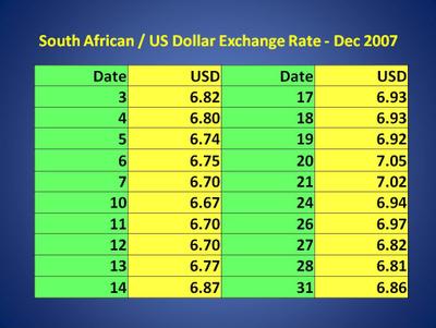
Have a look at the below table which contains one month of exchange rate figures.

What does the table tell you? Unless you are very used to looking at that sort of data, not much. Can you see the trends? How about the peaks and troughs?
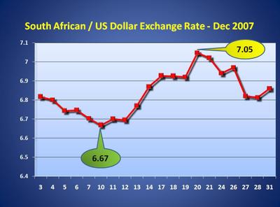
Now, have a look at this picture.

Now what do you see? Does it look a bit more simple? Is it less overwhelming? Does it give you a better idea of what the data is really doing? Remember that it is exactly the same data, just presented differently.
Converting any table of data into a graph is a very effective manner to simplify it, and to make it more accessible to your audience. Here are four tips for creating a graph:
- Make the data and lines clear and easy to read
- Minimize use of 3D – it can clutter the graph
- Only show data that is relevant – don’t display loads of data lines
- Clearly hi light points of interest (eg the max and min values above)
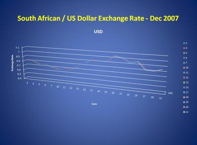
Of course, the usual rules still apply – make sure that your slides are clear and easy to read. Let’s look at this last slide.

Spot the problems:
- The axis labels are too small to read
- The 3D does not add to the graph
- The graph line is difficult to read
- The graph is bunched up in the top of the screen – the bottom is wasted real-estate
Please – don’t ever create a graph like that!
Remember – make your slides as clear and simple as possible!


