Presentation tips for PowerPoint

This is an extract of a training session that I present “Putting the POWER back into PowerPoint”.

Nowadays, many of us use PowerPoint for our presentations. While there are many courses and books on the technical side of how to create slides, there is very little material available on how to create effective slides and presentations. This course helps to address that issue.

Only use slides if appropriate. Nowadays, we often automatically haul out PowerPoint when asked to do a presentation. You need to ask yourself if the particular presentation really needs it, or if slides are not really necessary

Create slides around the presentation, not the presentation around the slides. Remember that the slides are there to enhance and not replace your presentation.

Use few and simple fonts and colours. The fewer you use, the easier it is to read.

Use contrasting colours. As above – it’s easier to read. Also test your slides under a variety of conditions to find what combinations work. My favourite is a navy blue background, with yellow headings and white text.

Use the 7×7 rule. No more that seven words per line; and seven lines per page. Rather put your main points onto the slides than a transcription of your speech. It is easier for the audience to remember a few points than an essay, and it allows for larger fonts to be used, hence making the slides more readable (especially from a distance).

Check spelling and grammar. This is just plain professionalism – it goes without saying.

Don’t read the slides verbatim. We can all read. Rather give us a few seconds to read a slide before speaking about the points on the slide. If you are presenting the slides point by point, then show the point while you discuss it. But please don’t insult me by reading the points aloud.

Use animated effects only if appropriate. They can really look cute, but can be distracting to the main point.

Audio and video clips add complexity to the presentation. Use them only if appropriate.

Rather use graphs than numbers. They are easier to read and simpler to understand. Remember that numbers tell, but pictures sell.

Rehearse with and without the slides. This gives you the power to still deliver a presentation should you have a major catastrophe with the slides (eg: the projector stops working half-way through a presentation).

Arrive at the venue early. This gives you plenty of time to setup and ensure that everything is working. It also allows for you to resolve any issues well-before time. If it’s a really important presentation, try to get there the day before as well so that you can check out the venue and ensure that all equipment is working.

Bring the following to your presentations:

  • Printout of slides- in case the projector fails.
  • Electronic copy in a few formats – so you can connect to another laptop should the need be required.
  • Long extension leads & multi plugs – so you can plug in wherever the plug points are.
  • Masking tape – tape down any long cables that you (or others) may trip over
  • Laptop and power supply – even if you know they are supplying equipment, rather have it there as a backup.

Finally two pointers for running the actual presentation:

Don’t run the laptop off batteries (no matter how fresh). I have seen many laptops shutdown or go into standby mode because the laptop was running on batteries, and either they went flat, or the presenter forgot to put the laptop into a “don’t go into standby” mode.

Speak to the audience, not to the screen. Many presenters read the slides (see point above) while facing the screen. This prevents you from making eye contact with the audience, and prevents them from hearing you. It’s also rude.

4 tips on PowerPoint

Use PowerPoint to enhance your presentations, not as a substitute for poor presentations.

  • Create your content first, and then create the visuals. Creating slides is far more fun that creating good content; don’t fall into the trap of creating great slides that support a weak message.
  • Budget your time. Allocate a set amount of time to create the slides, and budget that across all the slides you need. Otherwise your first 2 or 3 slides could be fantastic with no time to do a good job on the rest of the slides.
  • You don’t always need slides. Only use slides if they significantly enhance your presentation.
  • Focus on the message, not on the medium. Good slides will not hide a poorly crafted message.

Free PowerPoint templates

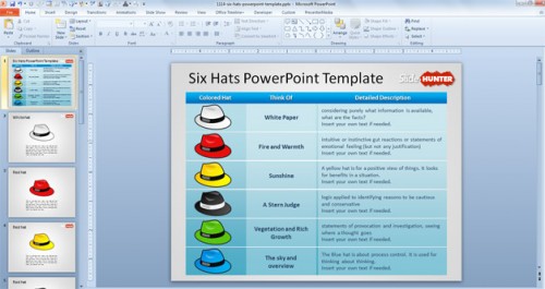
Here is a pretty cool website that I have been looking at: Slide Hunter, an online collection of free PowerPoint templates. There are almost 400 templates for download (and they are all free). Everything is indexed and categorised, and it’s easy to find the right slide for your presentation.

Here are two examples:

six-thinking-hats-powerpoint-template

6 Hats

free-brain-powerpoint-template-smart-background

Brain

The ones that I have looked at seem pretty good, and when you edit them all the graphics are seperate items, so you can easily move things around, change colours, customize fonts etc. Note that while you don’t have to register (it is optional and free), if you have not registered he askes you to post a tweet or Facebook update to download the templates.

If you really like the templates you can purchase and download the business pack, which is just over 100 slides, specifically focusing on business diagrams. This pack costs $49, but if you use this code 25PERCENT, you get a (suprisingly) 25% discount.

business pack

Some of the slides in the business pack.

Anyway it is worth checking out, there are some pretty cool slides there.

ps: I will given a free copy of the business pack for this review.

Presenter View; a quick tip

Here is a quick tip to make your PowerPoint presentations a little more effective. If you setup Presenter View, you can see a great summary of your presentation on your laptop screen, and show the regular presentation on the projector screen.

So when I give a presentation, I see something like this.

Presenter View

You can see which slide you are on, speaker notes, slide number, the next slide, timing etc.

Anyway, it is very simply to setup, just goto the slideshow menu and activate Presenter View. Note that it will only be available when you have an external monitor connected.

Presenter View

Charteo review – create custom slide decks

Here is an interesting way to create your presentations. It’s an online tool called Charteo, which allows you to create a custom slide deck based on a selection of over 10000 online slides. In summary, you pick and choose your slides and create a custom desk.

Select whatever slides you need, and once you are ready, checkout and it will create a downloadable PowerPoint presentation containing all your slide which you can then edit and customise as you wish.

Virtual deck

My virtual deck in progress.

You can either buy credits up front  and use them as you go, (starting at EUR 29 for 40 credits, scaling through to EUR 399 for unlimited credits).

They sell bundled slide decks to be customised for your own requirements. Eg the SWOT deck contains a selection of slides that would typically be used when doing a SWOT analysis. These decks can help you to rapidly put together presentations with a consistent feel (the bundles are also a lot cheaper than the bespoke decks).

Sample SWOT deck

Example of SWOT Bundled slide deck.

While I did not look through all their slides (they have over 10000), I had no difficulty finding suitable slides from my presentation. The website is also really easy and intuitive to use. Here is an example of it in use. Firstly a rough outline for a hypothetical speech:

Toastmasters Southern Africa

  • 9 countries
  • 9 divisions
  • 140 clubs
  • Club recognition
  • 10 goals
  • distinguished clubs
  • select distinguished clubs
  • president distinguished clubs

The trick with a tool like this is to firstly define your basic presentation layout and figure out what you are wanting to depict, and only then  use the website to find slides that match what you are trying to achieve. Otherwise you will find yourself falling in, and spending hours looking all the different layouts, and emerge having seen some great slides, but with little to show for it.

So here is how my slides look after I downloaded the sample deck and customised the content. I am really impressed at the quality of the slides. Start to finish took me about 20 minutes.

I think its a great tool that can help to make your presentations more effective (esp with the icons, graphing and charting slides), but I hesitate at the cost. At roughly EUR 4 per slide, it can quickly get expensive.

Would I use it for my everyday presentations? Probably not (simply because of cost). Would I use it for important business presentations where I can allocate budget? Absolutely; it will save you a lot of time and create some great decks.

It’s a pretty good tool, and I recommend that you give it a testdrive yourself.

Note that Charteo gave me 30 free credits to test with, which I used to create my test deck, and if you use the coupon code charteo10 in the provided field in the shopping cart, you will get a EUR 10 discount.

7 lessons from wordcamp

Last week I spoke at WordCamp, Cape Town (the WordPress conference), and I watched many of the other sessions as well. Here are a few lessons I learned from my and the other sessions:

  1. Keep the sessions short and sharp. If forces the speakers to be concise in their message, and the delegates can focus on a short message. This is something that TED do very well (max 30 minutes sessions)
  2. Keep words on the slides large; you simply cannot shot a screenshot of 50 lines of source code (in a technical session) and expect the delegates to be able to read or understand the code. If you need to show source code, only show the important couple of lines. Or course pictures and diagrams are much better, there were some great slide decks (and some bad ones as well).
  3. Arrive early. I got stuck in a downpour which stopped traffic. Thankfully I still arrived on time.
  4. Get the AV sorted out before you start. It is disruptive to have to stop halfway through your presentation to sort out your microphone
  5. Practise, I cannot over-emphasise this too much
  6. Get your bio in ahead of time. My bio was read exactly as written, which was great. It was easier for the MC, and for me
  7. Hang around afterwards. Some of the most interesting questions came during the tea break after my speech.


PowerPoint Karaoke slides

sidebar_logoOn Monday evening, I ran a PowerPoint Karaoke contest at the Cape Communicators Toastmaster Club. This is the first one that I ran, and it was a fantastic evening!

We had about 10 people who were each given a random deck of PowerPoint slides, and they were given about three minutes to present a presentation using their slides. It was all in good fun, and we had some very interesting takes on the topics.

It is a great way to both practise your impromptu speaking skills, and to have some practise with PowerPoint.

Here is how I did it:

  1. Draw for random speaking order
  2. Draw for random topic order – I didn’t want to be too nasty and give somebody a topic that they knew absolutely nothing about, so they could select topics beforehand. I also gave them 3 minutes to prepare – basically while the previous speaker was speaking. If you are feeling nasty, give them a topic just before they speak, and let them go – much as for a Toastmasters table topic session
  3. Each speaker got 3 minutes to speak. Timing lights at 2, 2.5 and 3 minutes
  4. I used the Toastmasters Table topics contest form as a “judging form”
  5. You are basically pretty free to make up the rules, so the above is what I did; feel free to adapt and let me know what works for you.

Here are all the decks that I used:

Each deck was approximately 5 slides long. Note that they are not “real” slide decks, but made up to give the speaker something to play with. Some of the topics are a little off the wall.

Many people have asked me for a copy of the slides so that they can present the Karaoke contests at their own clubs, so here they are. Please feel free to steal and disseminate. My only request is to let me know how it goes.

Please note that I have created these slide decks from a variety of publicly available material and slides that I have built up over the years. If I have inadvertently used copyright material, please let me know and I will remove it.

Finally, thanks so much to Imation for sponsoring the event. They gave us memory sticks and  tee shirts as prized. The sticks are 1 gig, and about 1cm square – really cute. They also gave me an amazing remote wireless projector adapter. This little device plugs into your USB port on one end, and the projector on the other, and voila, you have a wireless projector!

Leave a comment and let me know how your session goes!

PowerPoint Karaoke?

Here is an interesting technique that will both improve your thinking skills, and provide an unusual form of entertainment: PowerPoint Karoake. Basically, you have to present an impromptu PowerPoint presentation. From how I understand it, you are given a deck of slides, and you need to present an unprepared presentation using the slides (also known as Battle Decks).

You have to deliver a PowerPoint presentation about an unfamiliar topic, with slides you’ve never seen, to an audience eager to heckle and laugh at you. If you’re in your underwear, you’re having a nightmare. If you’re clothed, it’s called PowerPoint Karaoke

This is serious business, there are loads of prizes, including a grand prize of $5000. Unfortunately, the contest is only available to USA and Canada residents, but I still think that it could be quite a fun event to host anyway.

If you look on YouTube, there are over 125 different PowerPoint karaoke video’s, here are a couple that I enjoyed.

See you on the stage.

PowerPoint Presentations – a wishlist for 2009

I was recently asked by a fellow public speaking blogger, Olivia Mitchell from Speaking about Presenting what I would like to see in PowerPoint presentations this year. The answer to me is quite simple – LESS.

  • Less Slides
  • Less Text
  • Less Complexity

Less Slides

The trend in 2008 has largely been to replace lines and lines of bullet points with pictures illustrating the points. This is great because pictures have a powerful ability to illustrate points that text never will have. Hence the large and vivid pictures commonly used on newspaper front pages.

However, pictures are only part of the solution to giving an effective presentation. I still feel that most presentation need to be simplified and to have fewer slides. Remember that if a slide does not add to your message, it probably detracts from it.

Less Complexity

If you push the capabilities of PowerPoint (esp version 2007), you can create some amazing effects and transitions. Here is a great example. However, the more effects and transitions you add to your presentations, the more complex they become, and greater the chance of you messing it up. So, unless you really know what you are doing, or you have some great designers and PowerPoint experts working with you, you might want to cut back on the complexity.

I have also seen very few transitions, effects and animations that add to a presentation.

Less Text

We still need to see less text. Far to many presentations are text heavy. Laura Bergells makes a great point about going picture crazy and replaceing every single line of text with graphics. We do need to find a balance, but I would still rather see a presentation with too many graphics than with too much text.

So, lets cut back on the slides,simplifiy the slides that we keep, and use less text. Here’s to some great PowerPoint presentations in 2009!

Finding How-to’s for PowerPoint

When I present my PowerPoint training, I am often asked where people can find additional tips and help for creating their PowerPoint presentations. Here is a website to add to your resource list.

Dave Paradi has created a great list of PowerPoint resources, including videos, FAQ’s, technical help experts and support.

Enjoy!